UX RESEARCH | DESIGN | REFINE | GOING FORWARD
Product: A streamlined online donation experience for PANO designed to improve donor visibility, reduce friction, and support fast, confident giving on mobile and desktop.
Role: UX Researcher, UX/UI designer
Toolkit: Figma, Adobe CC, FigJam
Project Duration: 2 months
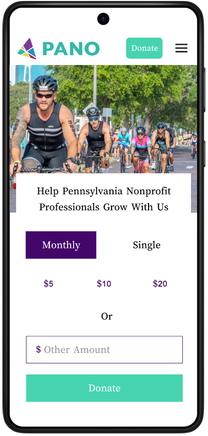
Hi-Fi PrototypePANO (the Pennsylvania Association of Nonprofit Organizations) is a statewide membership organization supporting the thousands of nonprofits that serve millions of people in the Commonwealth. The donor experience was in need of a redesign so that users can be well guided and give confidently to their work.
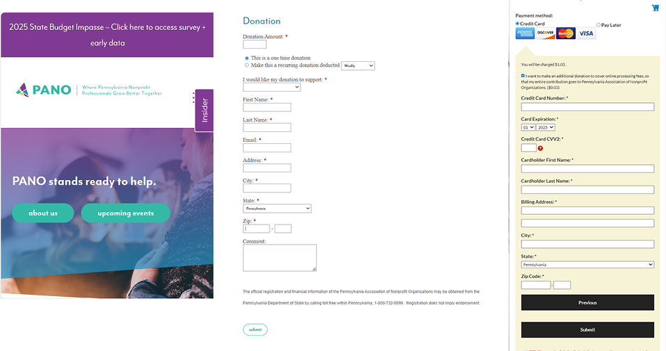
The donation experience was functional but hard to discover and execute on mobile. One could get the job done if they were set on it, but it had great opportunity for improvement. Donors needed a way to give online with less clicks and more payment options with confidence and ease.
To create a simple and intuitive donor experience where donors can confidently auto-fill details for a quick payment process, change payment methods, and eradicate the need for support call to complete the task.
Uncover pain points in the current mobile donation flow so that we can remove friction and ensure donors feel confident completing their gift.
Evaluate how long it currently takes users to complete a donation so that we can streamline the process and reduce abandonment.
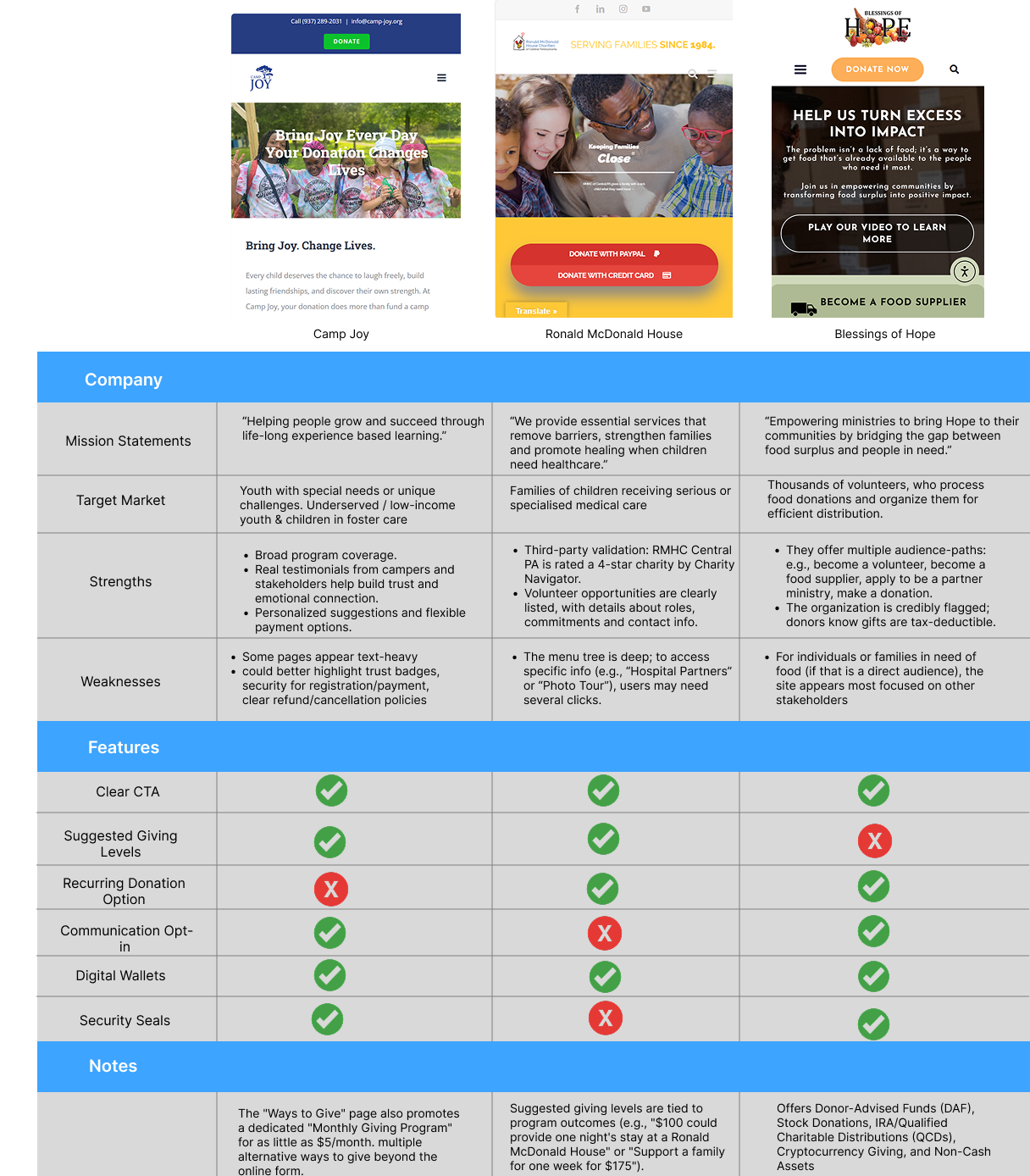
Benchmark competitor nonprofits' donation experiences so that we can align with user expectations and adopt proven patterns that improve conversion.
Five people were interviewed. All five were young professionals in the 20-35 age range. They participated in a moderated usability study of the PANO website on their phones.
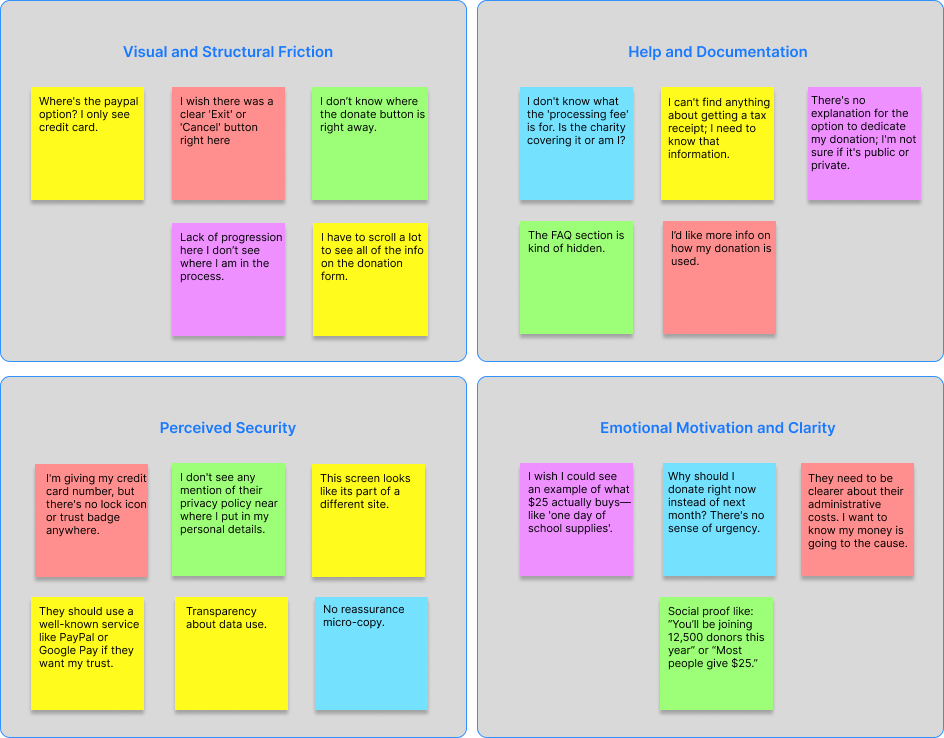
Lack of payment options; subtle to no visible “emergency exit”, CTA buttons could also use more prompting
Some people may opt out of completing their donation due to lack of additional information such as “Learn more” or “Agree to Terms and Conditions”
Need to increase a sense of security when providing sensitive details.
Before the form, donors should see what their gift accomplishes, why now, and where funds go

Persona #1
Age: 29
Education: Associate's Degree
Hometown: Philadelphia
Family: Single
Occupation: HVAC Technician
Clarence is busy with work but he believes in supporting local causes. He often donates to nonprofits when he sees an immediate need or is prompted by social media, but he is time-sensitive and expects the process to be fast and secure. He typically donates from his mobile phone during short breaks and is easily frustrated by slow loading times or too many required fields.

Persona #2
Age: 30
Education: Bachelor's Degree
Hometown: Glenside
Family: Married
Occupation: Dentist
Mike is financially stable and is a habitual, thoughtful donor. He often researches organizations before committing to a donation and may be interested in recurring donations or matching programs. He expects a professional, trustworthy, and informative experience. He is likely to donate from his desktop but values a clean, intuitive experience across all devices.
Donors decide emotionally before they act functionally. I want to lead with impact-first messaging before any inputs and keep it scannable for mobile. The primary CTA to Donate is high and obvious, not buried in navigation. Need quick reassurance before committing. Make recurring donations feel safe, optional, and reversible and fees should be totally transparent. Focusing on time to complete transaction, drop-off points, usage of quick-pay options.
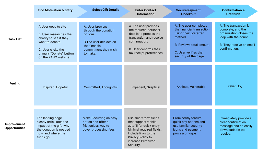
I want to avoid routing users through extra informational pages unless intentional. I want to make the choice between one-time and monthly donations clear and binary with simple language. Provide smart defaults for each step and don't overload the user with options. Go back must preserve all previous inputs and not reset. Don't want users to think about what the next step is or how to continue at any point so present smart defaults.

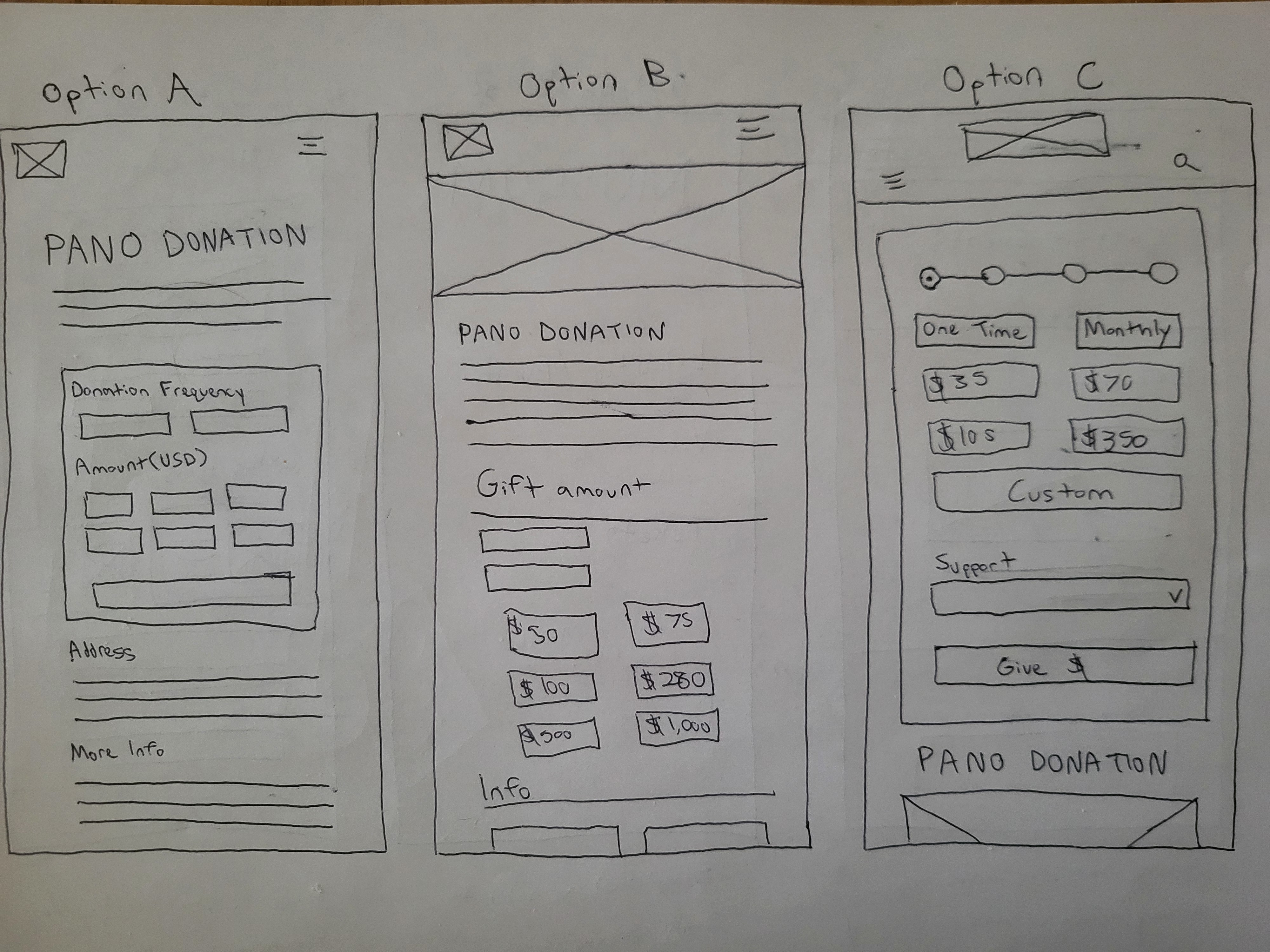
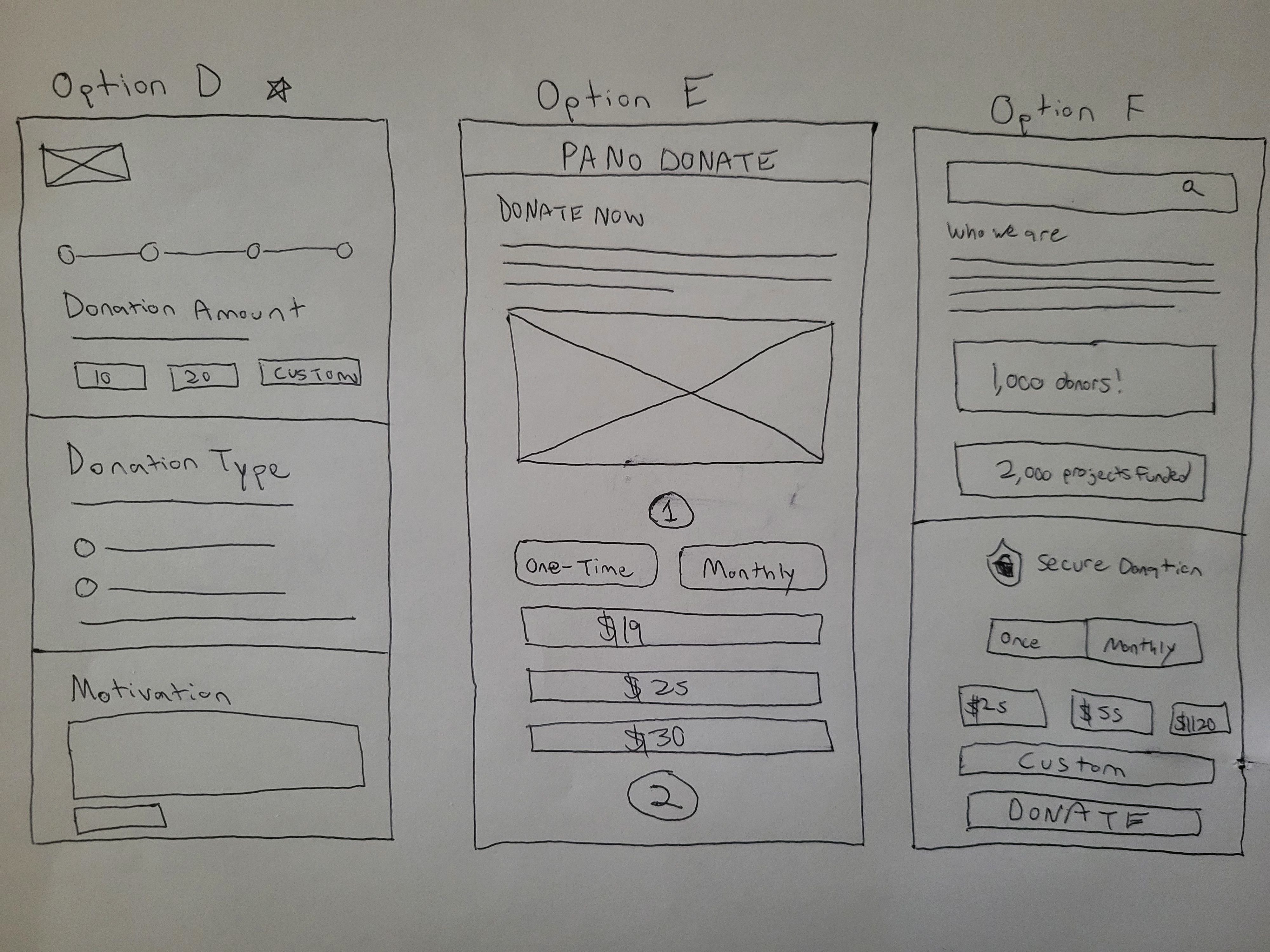
For these paper wireframes, I explored multiple layout directions to quickly test how different levels of guidance, information density, and visual hierarchy could support a fast, confident donation flow.
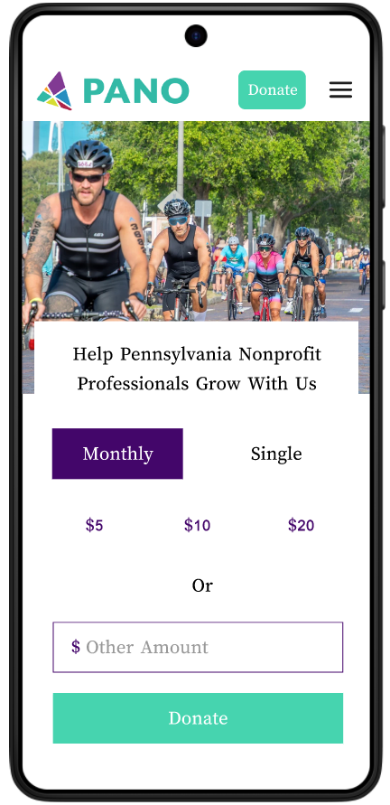
I focused on breaking the experience into manageable stages with visible progress indicators, allowing donors to make one decision at a time without feeling overwhelmed. Key elements like preset amounts, flexible donation frequency, and multiple payment options are surfaced early, while personal details and optional actions are deferred until trust is established.
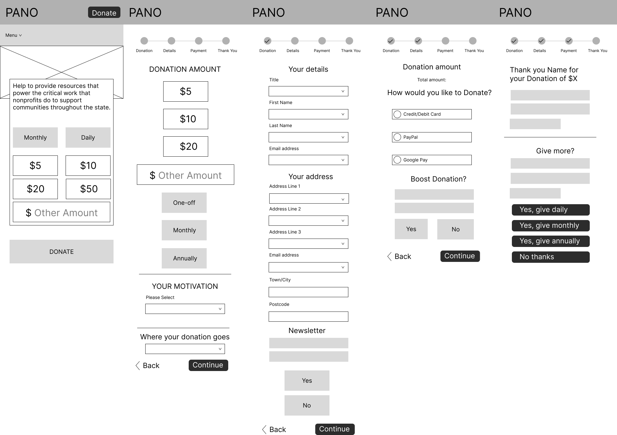
I connected each screen with interactive components and progress indicators to reinforce clarity and momentum. Preset amounts, recurring options, and fast payment methods were surfaced early to reduce friction, while secondary actions like comments or staying in touch were intentionally placed later so they wouldn't interrupt the primary goal of giving.
Throughout the process, I focused on making the prototype feel realistic and testable, paying close attention to spacing, hierarchy, and microcopy to communicate trust and security. I used consistent button styles, clear CTAs, and subtle reassurance cues to guide users forward, especially at moments where hesitation is most likely, such as payment entry. By iterating directly in the prototype, I was able to quickly assess flow timing, identify unnecessary steps, and ensure the experience felt fast, intuitive, and confident on mobile. I'm aligning closely with both user needs and the project goals.
The prototype I've created has been tested on 5 participants from ages 28 to 35 y/o.
Everyone successfully made it through to the end of the flow, but there were a lot of notes about text that could be cut or made more clear, or when certain options came up. A multi-page sequential layout was much preferable to a bunch of modals coming up on one screen.
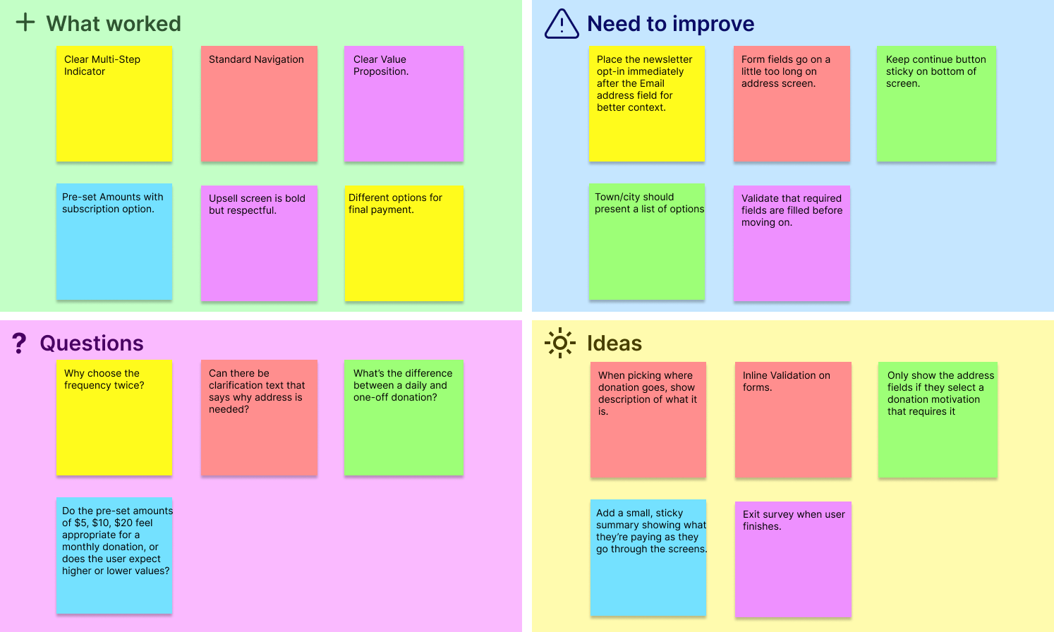
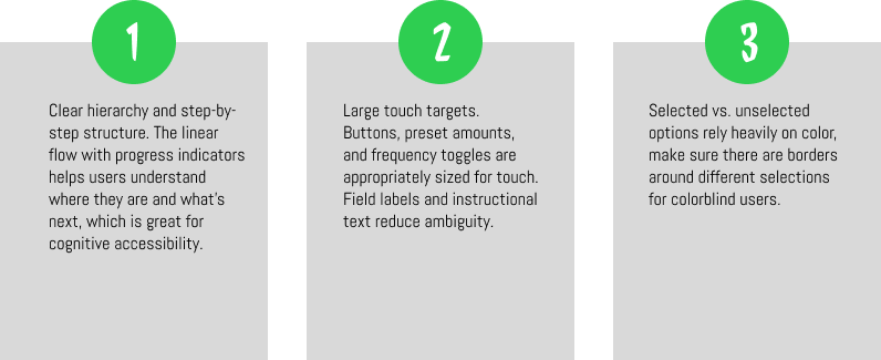
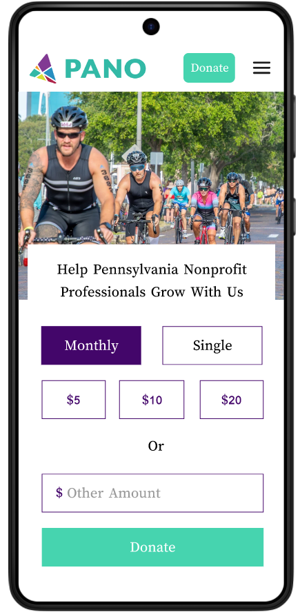
The selections needed borders around them to make it more obvious to people that these are selectable components.
 →
→
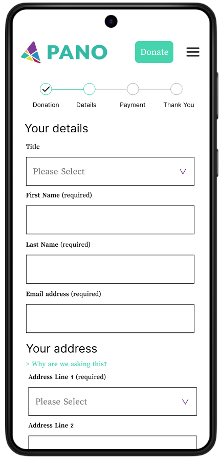
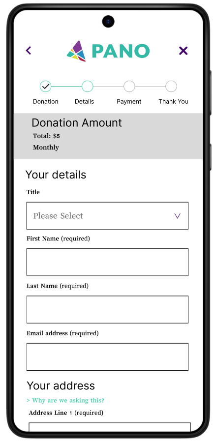
Users feel more comfortable when there is a reminder of what they are paying during the entire flow. Always want to be able to go back and exit easily, while retaining the information that was entered before.
 →
→
It was tough balancing the need for deep organizational transparency with the user's desire for speed. Early research indicated that donors wanted to know exactly how funds were used, yet adding this information threatened tand long-form fatigue I was trying to solve.
Managing this tension required careful information architecture. Like moving detailed documentation into optional "Learn More" accordions and strategically placing reassurance cues at high-friction moments, like the payment entry screen, without derailing the user's momentum.
This project reinforced that in a donation flow, emotional momentum is just as important as functional usability. By testing multiple iterations, I discovered that users were actually more comfortable with a multi-step sequential flow that provided constant feedback than a single-page form that felt overwhelming.
Even small usability tests revealed issues I hadn't anticipated, such as users losing awareness of total cost during multi-step flows or hesitating at payment screens due to a lack of trust signals. Addressing these findings early led to meaningful improvements with relatively small design changes.