UX RESEARCH | DESIGN | REFINE | GOING FORWARD
Product: A mobile app for the Hershey Story Museum that advertises exhibitions and events, provides museum information to patrons, and enables patrons to schedule visits.
Role: UX Researcher, UX/UI designer
Toolkit: Figma, Adobe CC, FigJam
Project Duration: 2 months
Hi-Fi PrototypeAs part of the Google UX Design Professional Certificate, learners are required to develop a comprehensive case study throughout the duration of the program. For this project, I selected the prompt: Design an app for a public museum to promote exhibitions and events, provide essential visitor information, and allow patrons to schedule visits.
I chose The Hershey Story Museum as the subject of this case study. As a well-known attraction that chronicles the life and legacy of Milton S. Hershey, the museum currently does not offer a dedicated mobile application or a fully integrated e-ticketing experience. Instead, it relies on a responsive website to share information about exhibitions, events, and ticketing, making the website the primary digital touchpoint for visitors planning their trips.
This case study is a conceptual project created solely for educational purposes.
Users expect a streamlined visitor experience by having a platform for ticket ordering, reservation of specific arrival dates and times, and the generation of an e-tickets for quick and seamless check-ins which the museum website does not provide.
Design a mobile app that will let users easily find and book museum tickets for the Hershey Story Museum which will give visitors confidence, save them time, and generate revenue for the museum.
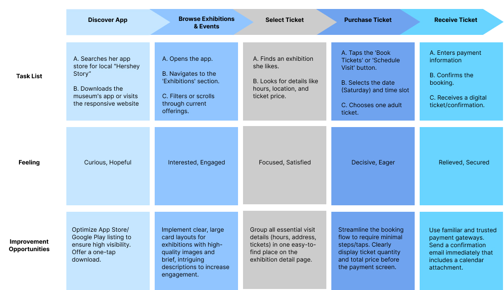
Investigate what steps users currently take to buy tickets and enter the museum, so that I can map the current user flow and identify opportunities for optimization and efficiency in the app design.
Identify pain points with the current website and pre-visit experience, so that I can design features within the new app that specifically address and resolve those user frustrations.
Determine if an in-app e-ticket is desirable, so that the museum's digital offering aligns with modern ticketing standards and meets the competitive expectations of today's museum visitors.
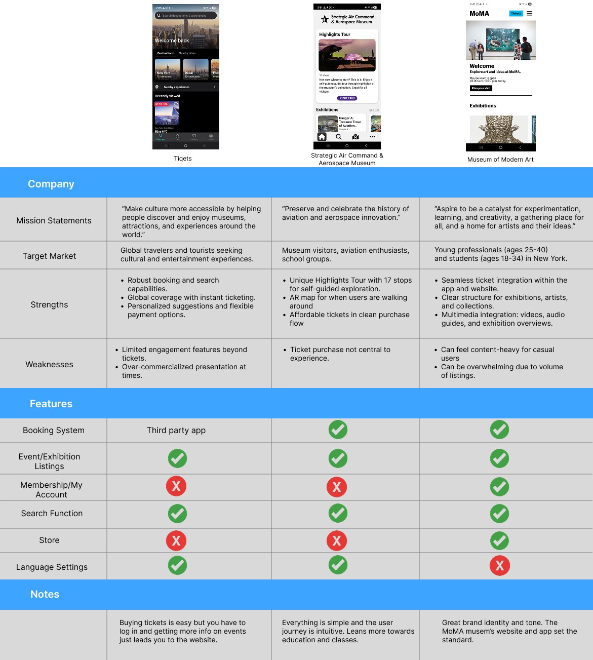
Four people were interviewed. Two participants were from middle to high-income brackets in the 20-35 range, and another two were retirees from the 60-75 range. They participated in a moderated usability study of The Hershey Story Museum's website on their phones.
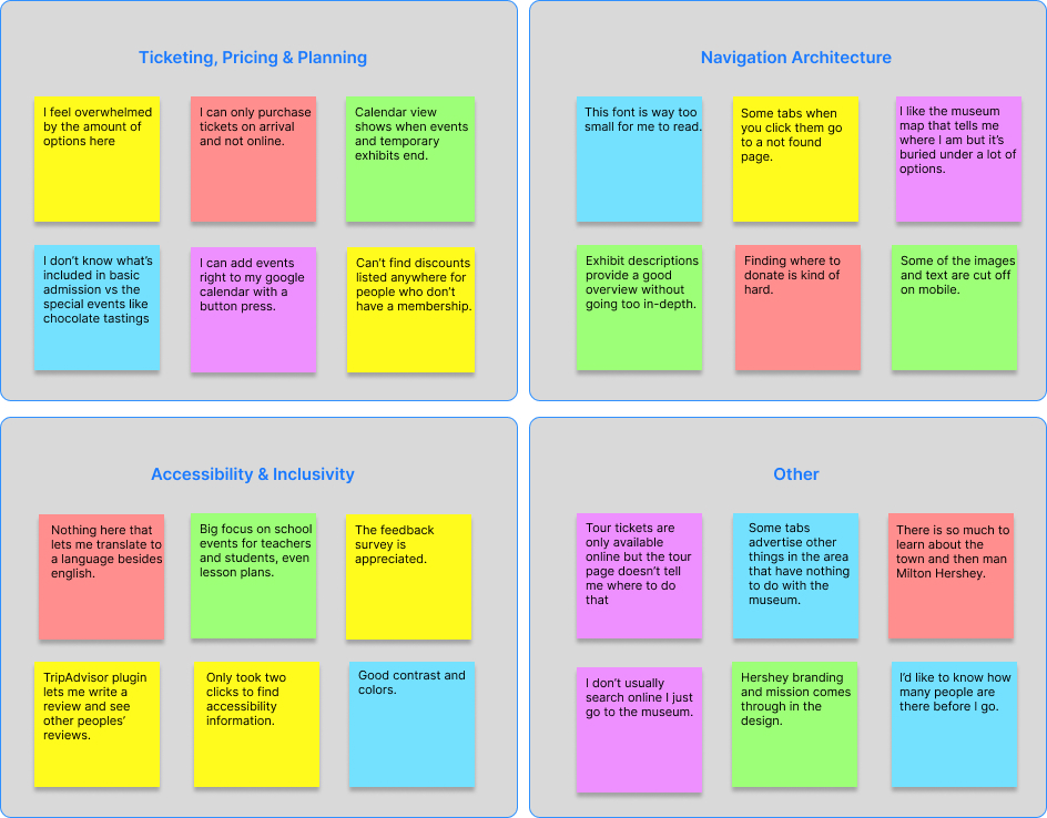
Some users prefer to buy a ticket online and show it at the door. They'd also like to bundle admission with event tickets.
Older users can find the site difficult to use, read, and navigate on a smartphone. There's a need to categorise and consolidate the information presented.
Some images do not have alternative text available and you have to use Google Translate to get the site in other languages.
There is so much information that it can be overwhelming to users. Mobile optimization can go a long way in converting users to visitors or donors.

Persona #1
Age: 74
Education: Bachelor's Degree
Hometown: Hershey
Family: Married
Occupation: Retired Nurse
Carol enjoys exploring attractions with her family. She needs a clear, accessible way to learn about exhibits, plan group visits, and get visitor information because she values cultural connection and lifelong learning.

Persona #2
Age: 35
Education: Master's Degree
Hometown: Harrisburg
Family: One child
Occupation: Teacher
Nia and her son Franklin take family trips once or twice a month. She looks for hands-on experiences that spark curiosity in Franklin. She prefers mobile tools that summarize exhibit highlights, let her see busy hours, and help her plan around her busy schedule.
The primary goal of this journey map was to visualize the end-to-end experience of a user. I'm taking them from the initial spark of curiosity to the moment they walk through the museum doors to ensure the app solves for friction at every touchpoint.
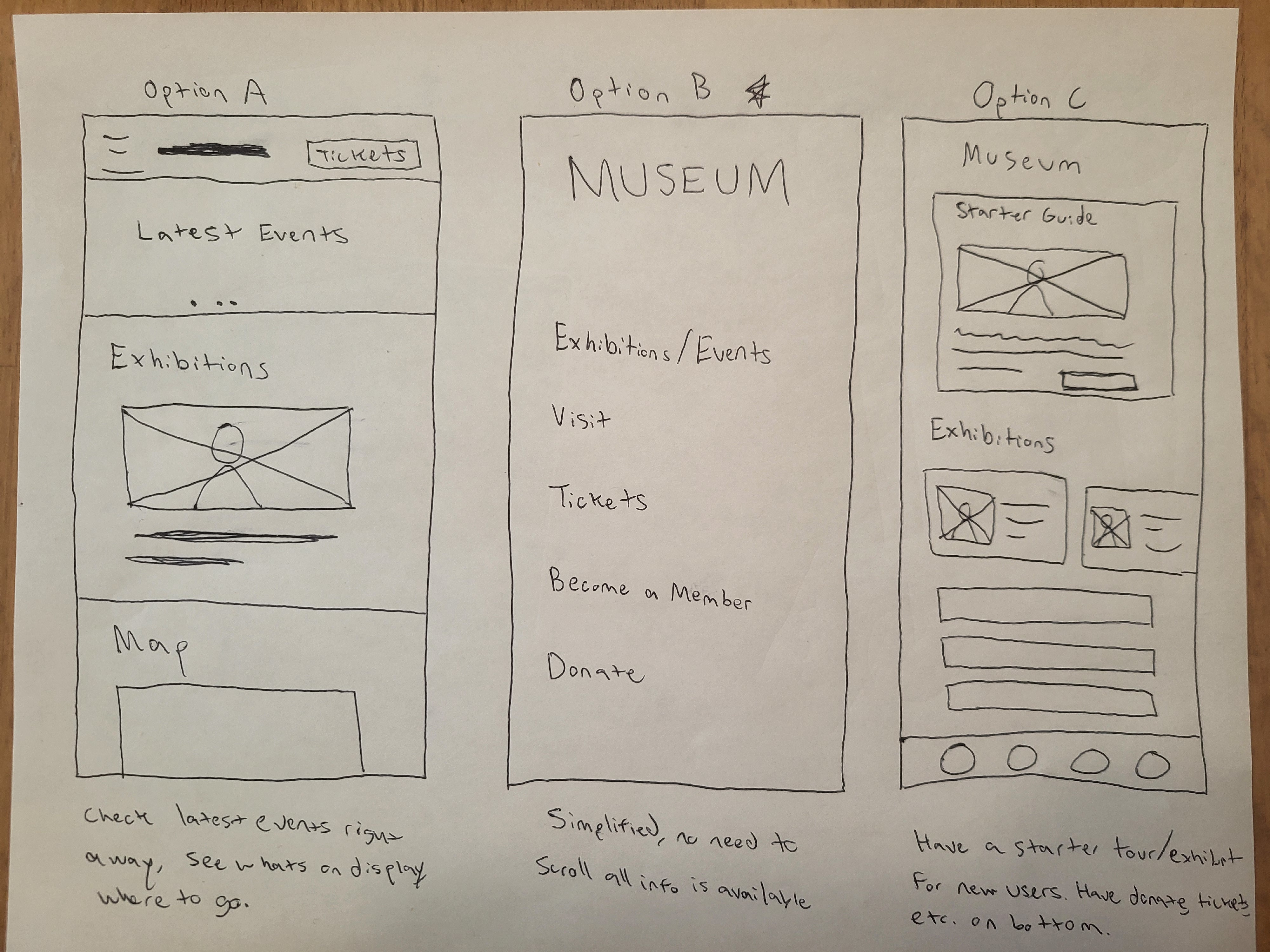
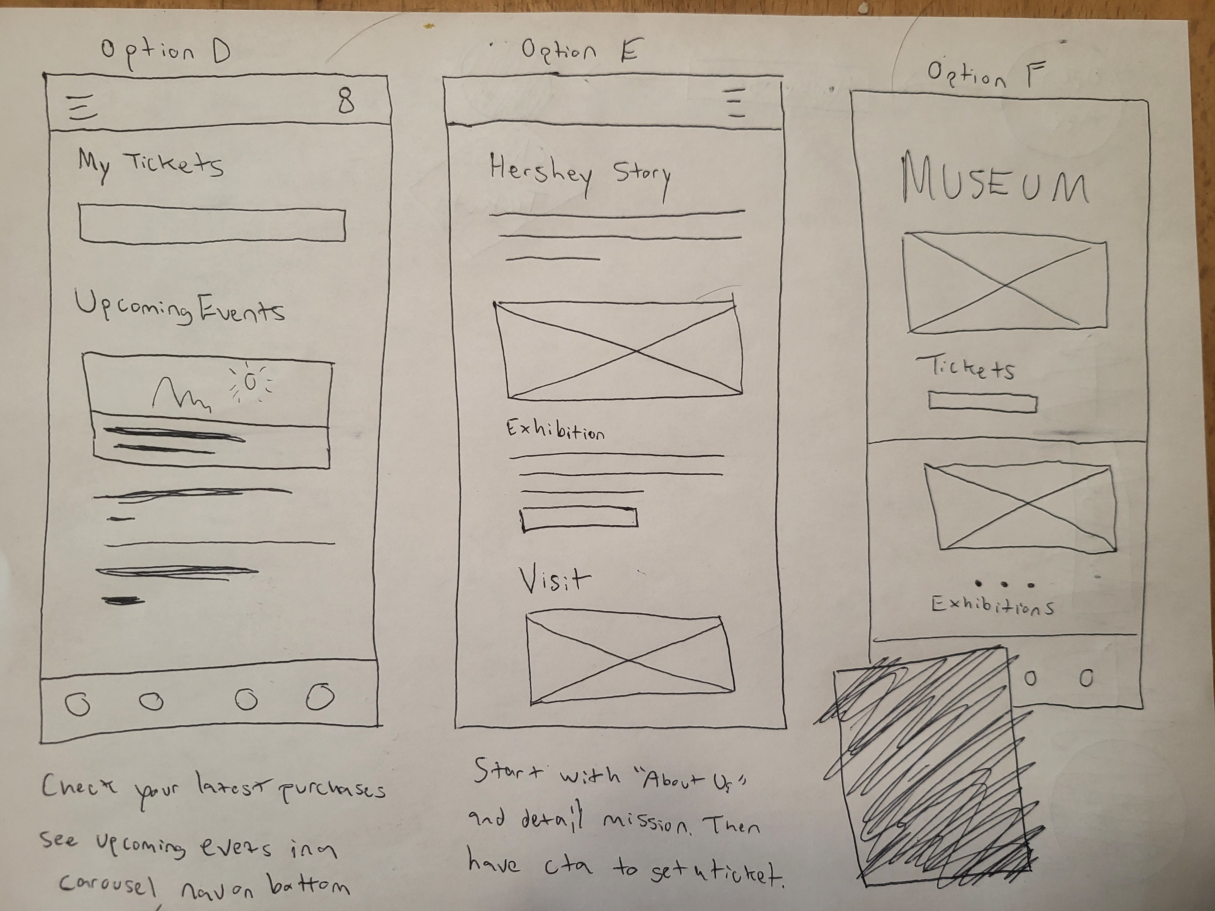
The sitemap step made me conscious about the existing website. This was crucial to understand how my museum app works, what information is most critical to present to the user, and what I can add. The original had many different pages that could be consolidated.
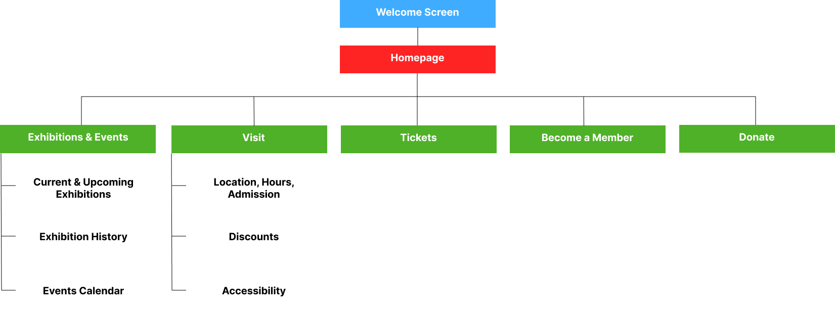
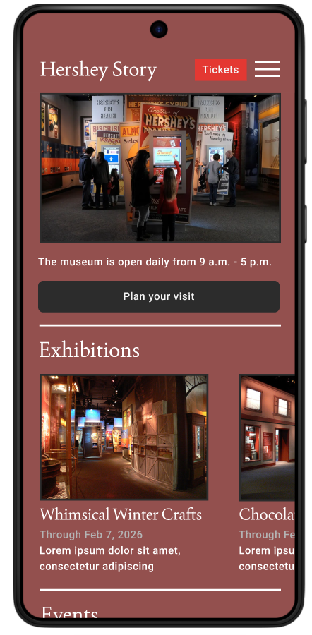
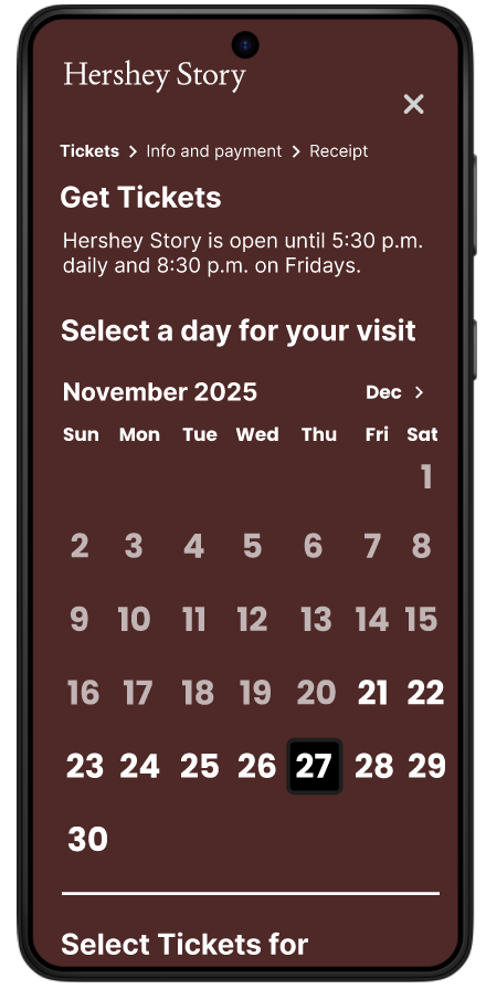
I wanted to make tickets easily discoverable or, "above the fold" so that users would not need to scroll to find it. I want to present the museum's exhibits and what it has to offer on the home page and then convert them into visitors.
The app utilizes a hierarchical architecture for exploration, allowing users to navigate naturally from the homepage into specialized sections like exhibit details and memberships. Conversely, I implemented a linear, sequential flow for the ticketing process to minimize cognitive load and ensure a frictionless checkout experience.
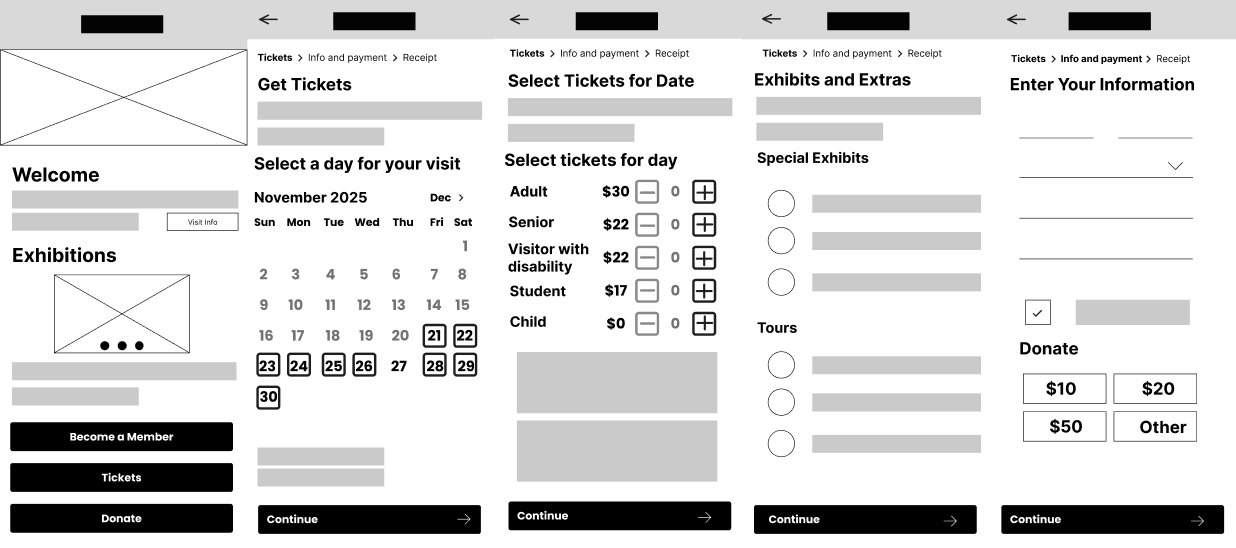
I used a slide-up animation for the ticket ordering portion of the app to reinforce that the user is now in a seperate flow from the homepage and regular navigation. I also use a 'push' effect so that transitioning between pages on the ticket order isn't so jarring.
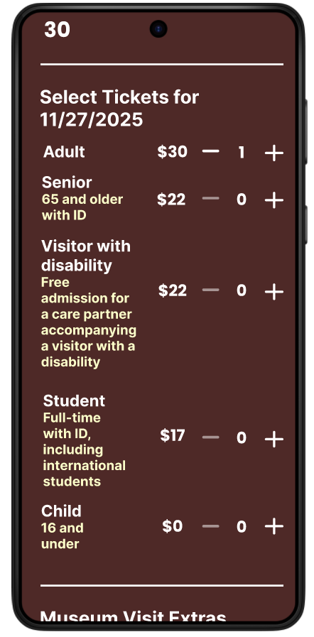
I decided on a rich, thematic color palette with deep chocolate tones to maintain brand immersion throughout the entire user journey. Larger, high-contrast stepper buttons implemented to significantly bumped up to meet accessibility standards.
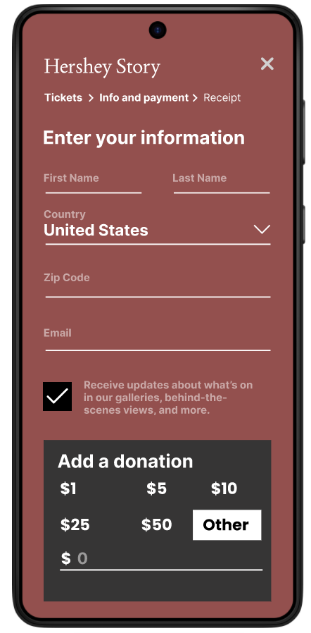
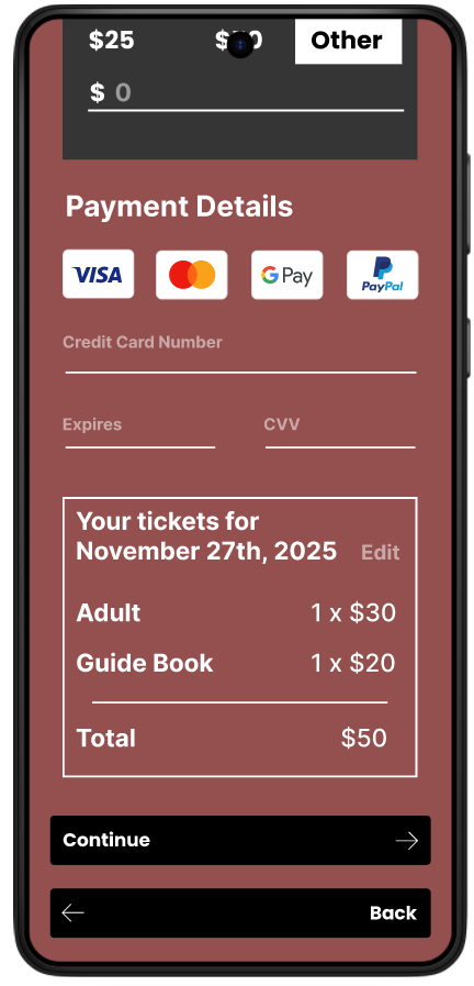
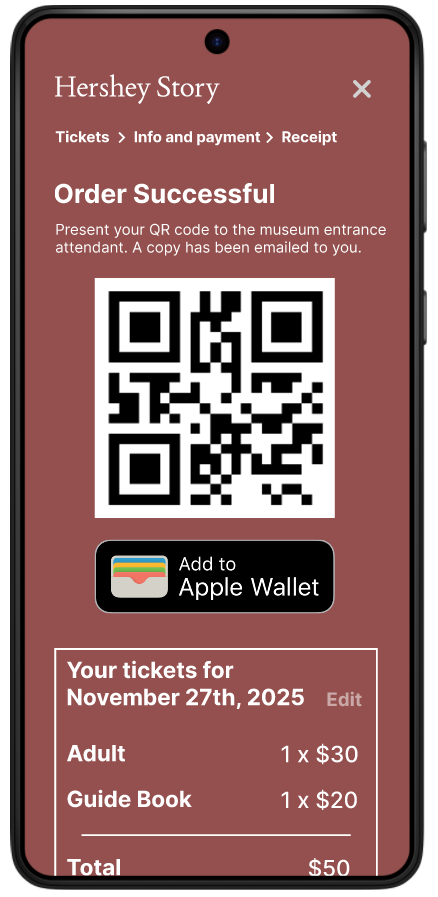
I included descriptive copy for the extras (Guide Book, Guided Tour, and Audio Guide) along with clear pricing. I also added those orders specifically to the final receipt, showing it was included in the purchase along with the regular ticket admission price.
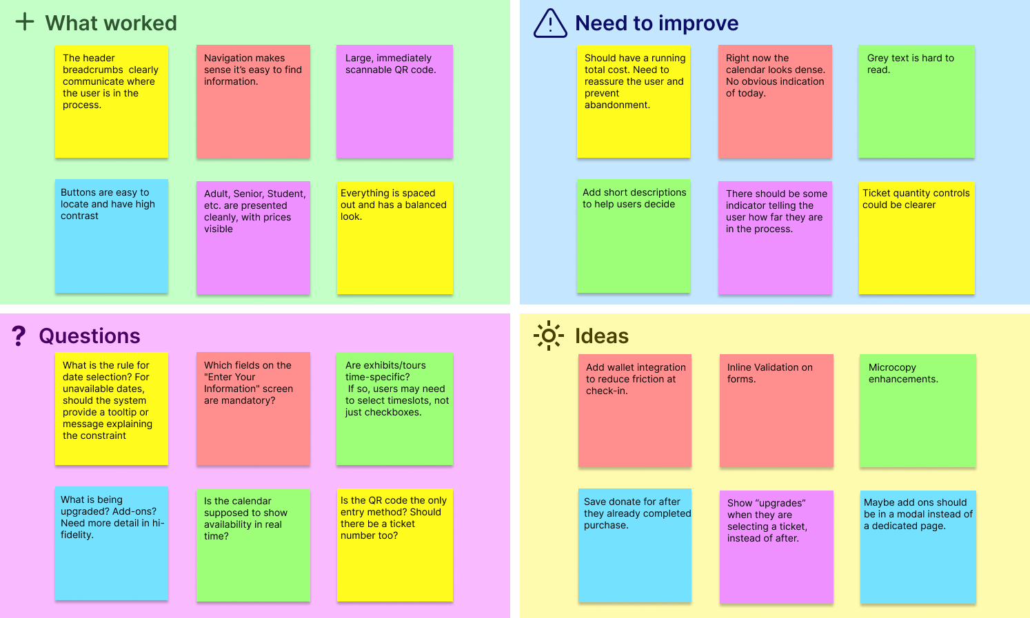
The prototype I've created has been tested on 6 participants from ages 25 to 75 y/o.
I've collected lots of feedback, some of them quite interesting as well as unexpected. This helped me make several small updates in order to achieve a smoother flow. From here I can create more detailed mockups and then iterate on them.
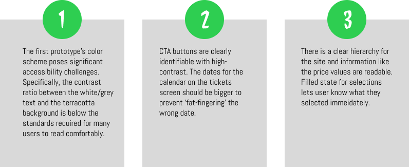
Users are often wary of entering credit card data into unfamiliar interfaces without visual trust signals. I added brand logos for acceptable payments including Visa, Mastercard, Google Pay, and PayPal which builds immediate trust and informs the user of their payment options before they start typing.
Users found the multi-step process tedious or lost context of their total price while navigating. New mockup consolidates the date selection, ticket types, and museum extras onto a single scrolling page. This allows users to see the "big picture" of their visit before clicking "Continue."
I needed a different color scheme. Darker background for higher contrast with the white text and instead of grey for secondary text, use a cream yellow.
Designing within the constraints of an existing museum brand and website structure was one of the most educational challenges of this project. While the goal was to create a modern, mobile-first ticketing experience, I had to balance innovation with familiarity so that the app felt trustworthy and aligned with the Hershey Story Museum's established identity.
Another challenge was simplifying a content-heavy experience without removing important information. The museum website contains a large volume of historical, logistical, and promotional content, which can quickly overwhelm mobile users. Deciding what information was critical before a visit versus what could be surfaced during or after required careful prioritization and repeated iteration.
This project reinforced the importance of designing for clarity. Users consistently responded best to interfaces that made next steps obvious, minimized decision fatigue, and provided reassurance at key moments especially during ticket purchasing and payment.
I learned how valuable early research and testing are in preventing wasted effort later in the process. Even small usability tests revealed issues I hadn't anticipated, such as users losing awareness of total cost during multi-step flows or hesitating at payment screens due to a lack of trust signals. Addressing these findings early led to meaningful improvements with relatively small design changes.