UX RESEARCH | DESIGN | REFINE | GOING FORWARD
Product: A personal rock-climbing tracker that gamifies progression and gives meaningful performance analytics to users.
Role: UX Researcher, UX/UI designer
Toolkit: Figma, Adobe CC, FigJam
Project Duration: 2 months
Hi-Fi PrototypeClimbing has exploded in popularity over the past decade, especially with the rise of indoor climbing gyms and the sport's inclusion in global competitions. As more climbers enter the scene, many look for ways to track their progress, set goals, and understand how they're improving from session to session.
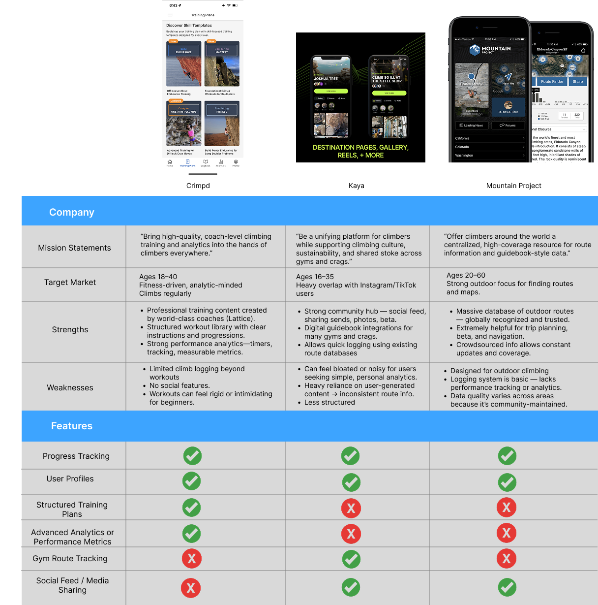
While there are apps on the market for logging outdoor climbs or browsing route databases, most of them are either too complex, too community-driven, or lack meaningful analytics. At the same time, many new and intermediate climbers rely on ad-hoc notes, photos, or memory to gauge their development which makes it difficult to see trends, stay motivated, or feel the impact of consistent training.
Dyno is a mobile app created to solve that problem. It helps climbers easily log climbs, visualize their improvement over time, and stay motivated through gamified progression, daily challenges, and achievement milestones. By combining simple logging with engaging feedback, Dyno gives climbers a clearer sense of where they are, how far they've come, and what goals to reach for next.
Many climbers want to understand their progress, improve their skills, and stay motivated, but the tools available to them are either overly complex, community-focused, or lack meaningful feedback. As a result, climbers often rely on scattered notes, memory, or inconsistent logging habits, making it difficult to track improvement, identify patterns, or set achievable goals.
Design a mobile app that enables climbers to easily log their sessions, track meaningful performance insights, and stay motivated through structured goals and gamified progression. The app should simplify the climb-tracking process, highlight improvement over time, and encourage consistent engagement so users can build confidence, develop skills, and achieve their personal climbing objectives.
Understand how climbers currently track their sessions and progress so I can identify gaps in their routines and uncover opportunities for a more intuitive and motivating tracking experience.
Discover what types of data climbers find most helpful when reflecting on performance so the analytics and insights in the app highlight the metrics users actually care about
Understand how climbers define “progress” in their own terms so the app's gamification (XP, levels, streaks) reinforces real improvement instead of feeling arbitrary.
Evaluate how much social interaction climbers want in a tracking app so I can determine whether Dyno should remain personal and minimal, or integrate optional community or sharing features later on.
Explore the frustrations users face with existing climbing apps so Dyno can avoid common shortcomings and focus on delivering clarity, simplicity, and meaningful value.
Four people were interviewed. All four were in the 20-30 age range and frequently went to climbing gyms.
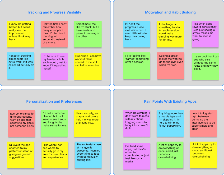
Climbers want an easy, low-effort way to log their climbs and clearly see their long-term progress without relying on memory.
Users stay more engaged when the app provides small rewards, streaks, or challenges that make climbing feel fun and motivating.
Climbers have different goals and learning styles, so they want an app that adapts to their individual needs, patterns, and interests.
Current climbing apps often feel too complicated, too social, or too cluttered, making logging slow, frustrating, or overwhelming.

Persona #1
Age: 29
Education: Bachelor's Degree
Hometown: Denver
Family: Lives with partner
Occupation: Product Designer
Alex climbs 2-3 times a week at local gyms and enjoys a mix of bouldering and top rope. He's motivated by feeling steady improvement but struggles to see long-term progress without tracking. He loves simple, clean digital tools that help him stay consistent and feel proud of his gains.

Persona #2
Age: 22
Education: College Student
Hometown: Philadelphia
Family: Lives with roommates
Occupation: Part-time barista
Amy began climbing six months ago and instantly fell in love with the sport. She climbs with friends at her gym and wants to get stronger, but she's not sure what “progress” really looks like yet. She enjoys gamified apps that keep things fun, colorful, and intuitive.
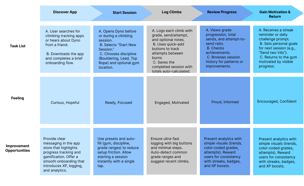
I broke the journey into clear phases: discovering the app, starting a session, logging climbs, reviewing progress, and staying motivated. Each step reflected an actual mindset a climber has before, during, and after climbing. For each stage, I paired user actions with emotions, pain points, and design opportunities, making sure moments like logging attempts or reviewing progress felt fast, rewarding, and low-friction. This helped me translate research findings into concrete UX decisions, ensuring the journey supported habit-building, visible progress, and motivation without overwhelming users or interrupting their climbing flow.
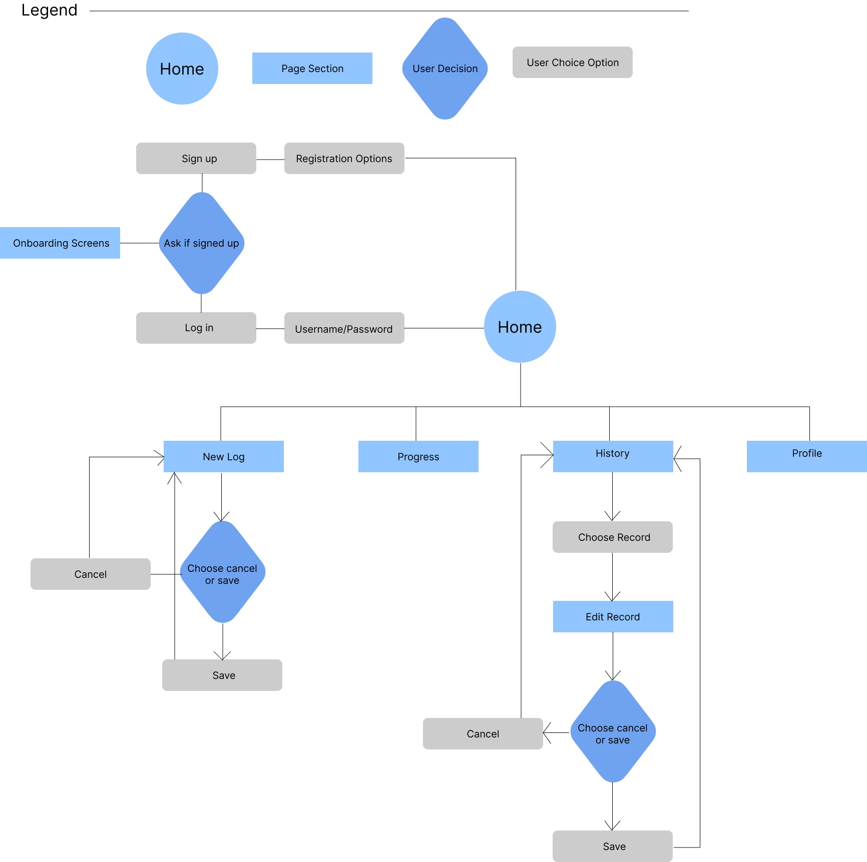
I designed the user flow to clearly map how someone moves through Dyno with minimal friction, starting from entry and ending with meaningful action. The flow begins at the home screen, guiding new users through sign-up or login and a short onboarding before landing back on home with access to core features. From there, users can easily start a new log, view progress, browse history, or manage their profile. Key decision points like saving or canceling a log or edit are intentionally simple and consistent, reducing cognitive load and preventing accidental data loss. By visualizing these paths and decision moments, I ensured the flow supports quick logging during climbs, easy record editing after sessions, and smooth navigation overall, reinforcing Dyno's goal of being fast, intuitive, and interruption-free.
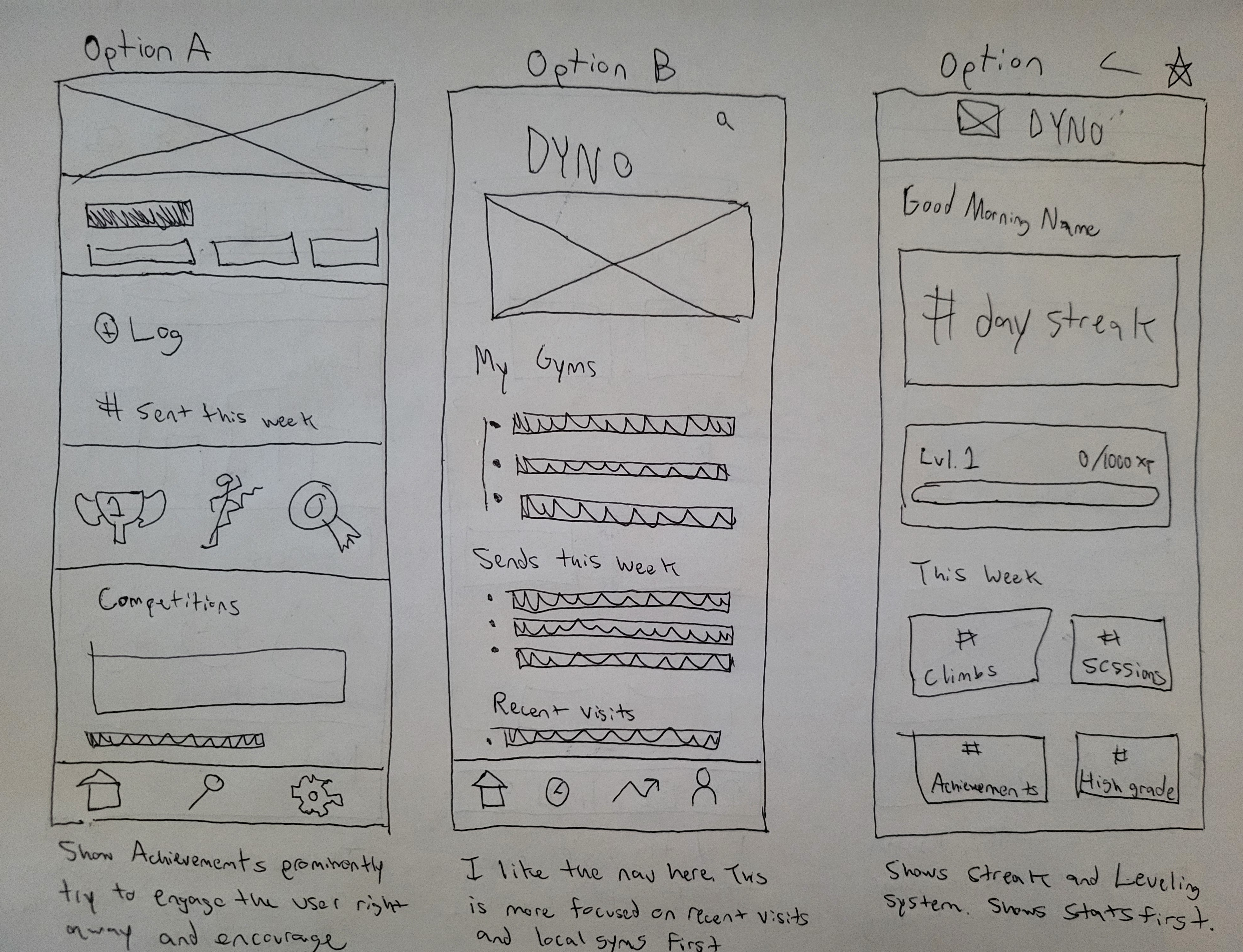
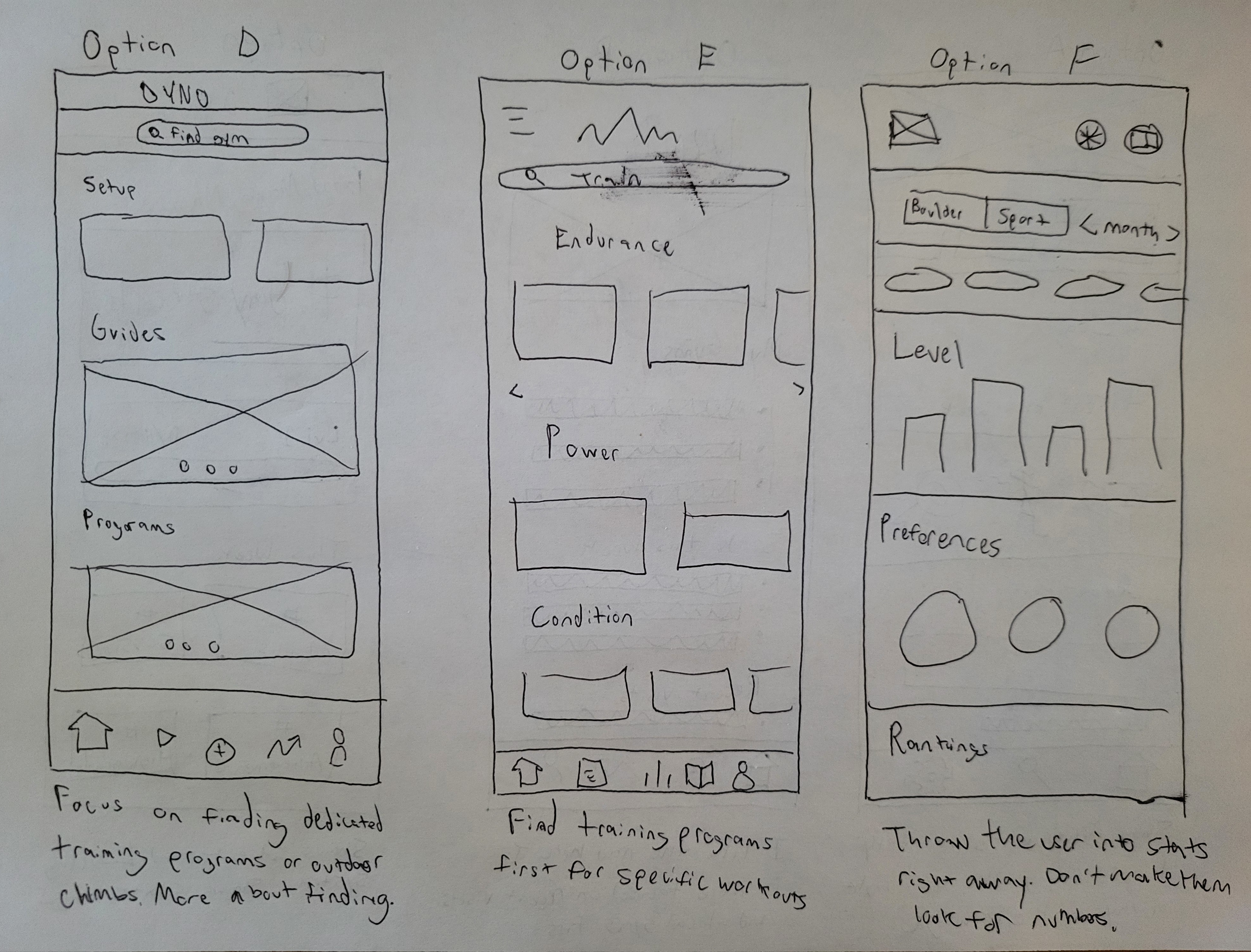
I sketched several options to experiment with what should feel most prominent. Achievements, recent activity, stats, gyms, or training without committing too early to a single solution. Each option emphasized a different user motivation, like instant encouragement through streaks, quick access to logging, or deeper performance insights, which helped me compare tradeoffs side by side. Keeping the wireframes low-fidelity allowed me to think through hierarchy, navigation patterns, and information density without getting distracted by visual polish.
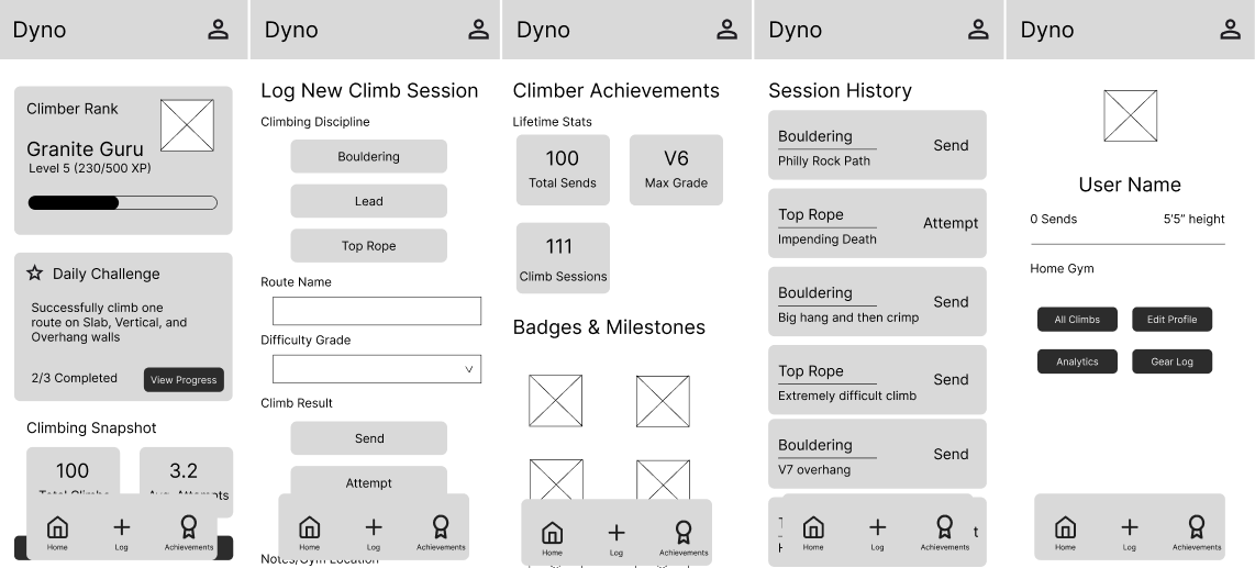
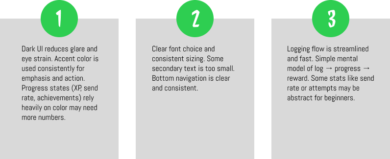
I focused on establishing a consistent layout system, navigation pattern, and component hierarchy across key screens like home, logging, achievements, history, and profile. At this stage, I prioritized clarity and usability and made sure primary actions like starting a log, viewing progress, and reviewing past sessions were easy to find and quick to access.
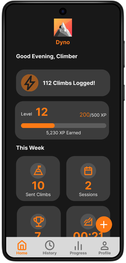
When building the prototype, I connected the high-fidelity screens into realistic, end-to-end flows that simulate how climbers would actually use Dyno during and after a session. I focused on core interactions like logging a climb, checking progress, viewing achievements, and navigating between tabs to ensure transitions felt smooth and intuitive. Interactive elements such as progress indicators were wired to reflect real feedback
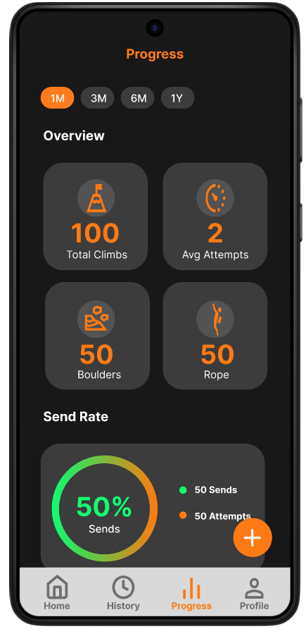
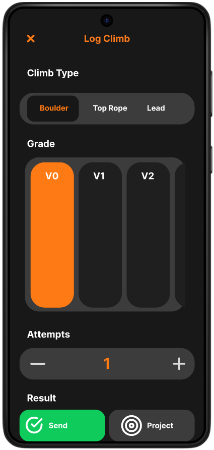
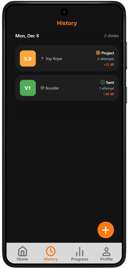
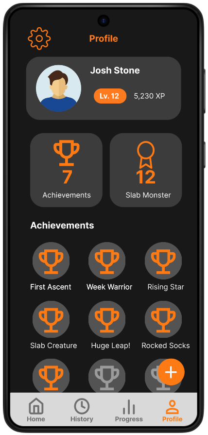
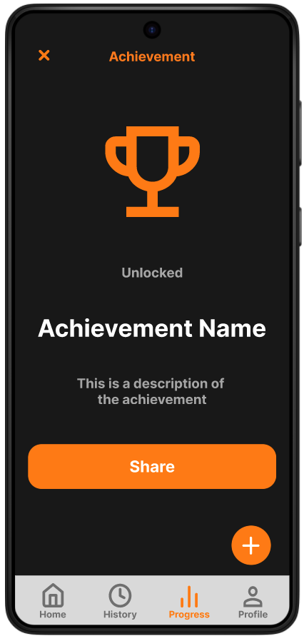
There are many achievements linked to different kinds of climbs. Each achievement is worth a specific amount of XP, with the number scaling with the difficulty of the recorded climb. So climbing a v2 would not yield the same XP as a V5. A user can check the requirements for different achievements and see ones that they've already earned by touching them in the profile section. Users can also see a chart of all their recorded attempts and sends to see how they're progressing over time.
The high-fidelity prototype was tested with six participants between the ages of 20 and 30 to evaluate the clarity, efficiency, and overall usability of Dyno’s core flows.
Participants were asked to complete key tasks such as starting a climbing session, logging attempts, reviewing progress, and navigating between primary sections of the app. Overall, users found the experience intuitive and engaging, particularly praising the straightforward logging flow, clear progress indicators, and minimal visual clutter. Testing also surfaced several areas for refinement, including reducing form density during logging, improving feedback after challenge completion, and clarifying navigation hierarchy in session history.
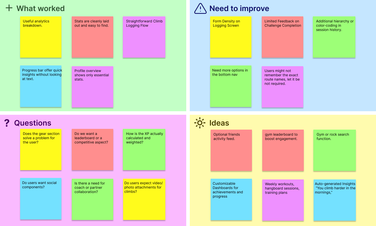
Early versions of the log felt too dense, requiring users to think through multiple inputs before saving. Inputs were grouped more clearly, tap targets were enlarged, and defaults were introduced to minimize friction for repeat logging. I also improved immediate feedback after saving a log so users felt confident their climb was recorded without needing extra confirmation steps.
For achievements, I iterated on both how progress is surfaced and how rewards are experienced to make them feel motivating without overwhelming the user. Early versions treated achievements as static badges, but testing showed users wanted clearer feedback on what they had earned and why it mattered. In response, I refined the profile layout to highlight achievement counts and titles up front, giving users an immediate sense of accomplishment tied to their overall progression.
The primary challenge of this project was balancing the depth of data analytics with the need for speed and simplicity in a high-activity environment. Climbing is a physically demanding sport performed in short bursts, meaning any friction in the logging process would lead to users abandoning the app mid-session.
By integrating gamified elements like XP and achievement badges I transformed what could have been a tedious data-entry task into a rewarding feedback loop. Moving forward, I will always look for ways to bridge the gap between functional utility as well as "emotional utility" that keeps users coming back. Too many options can introduce analysis paralysis. I would save extra features for a desktop version of the app.